What Does a good resume looks like?
What does a good resume look like?
This is the most comprehensive article on what a good resume looks like. Let us get right to it.
The perfect resume is what makes you stand out from the crowd of thousands of job seekers.
However, to be blunt, making one isn't anybody's idea of entertainment. With so many contradicting suggestions, you may feel as if you don't know where to begin or what to even do. Well, you should not worry because this article has done the major work of tough lifting what a perfect resume looks like and also serves as the ultimate guide to your creating a resume that recruiters will love.
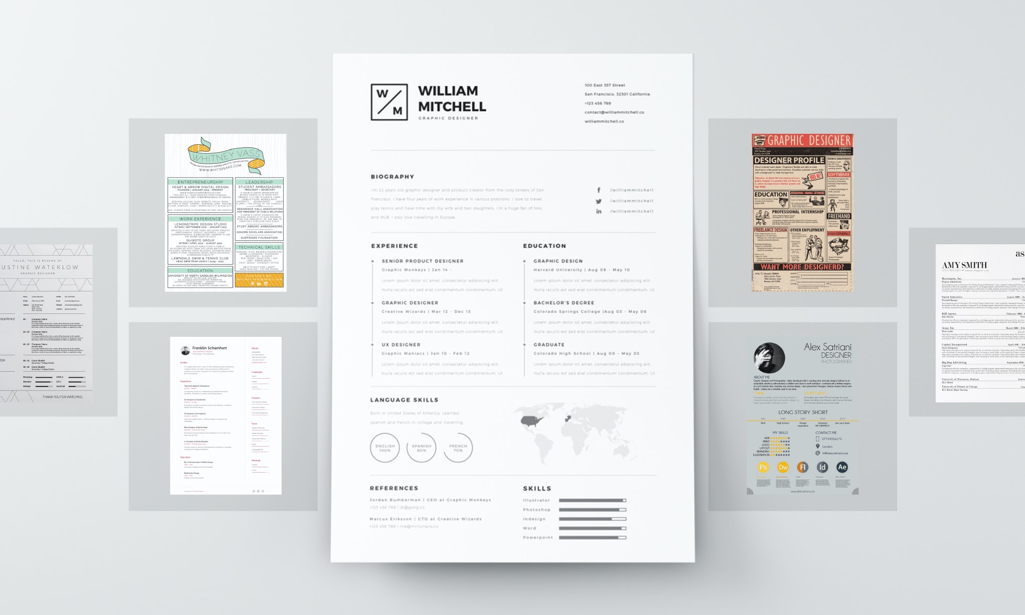
We looked through some of the greatest resume tips and collected them into a single chart to provide you with an incredibly simple layout for a CV that will amaze interviewers and, perhaps, earn you the desired dream job.
Almost everyone prefers to judge things based on their physical appearance. Hiring managers are not left out of the list. Your chances of getting a job can only increase if you present an engaging resume on the recruiters' table.
Most job experts can comfortably compare a good-looking resume with a smart dressing for a job interview. Most recruiters spend countless hours reviewing applicants' resumes.
Therefore, they may not have all the time to read across a particular resume. A glance at a particular resume will determine whether they should proceed to read the content or move into another resume. You are expected to write your resume only with the information you know.
You need to see the proper way and tactics to follow and arrange your resume in such a way that your chances of getting employed will increase.
A good resume isn't just a regular resume you see on the internet. It must be properly created with distinctive features that will present your skills in a special way to your recruiter.
Therefore, you must be extra careful as you craft your resume.
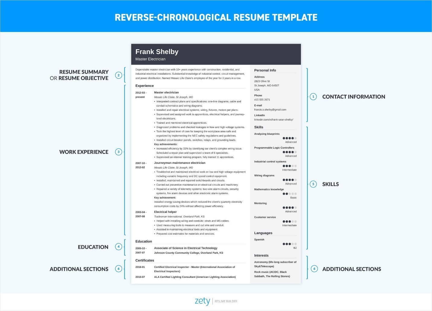
What are Resume Proper Formatting and Designs?
Before you consider submitting your resume to a recruiter, ensure that it must have passed through proper formats and follow a well-structured design. As you consider winning the heart of recruiters, your resume format and design must be professional, engaging, and inviting.
Therefore, you must make appropriate decisions on the right words before you begin to write. Sometimes, you need to put yourself in the shoes of the hiring managers to see how they will react to your content before you begin to compile your Creativity on a resume.
. Every good resume is expected to adapt to the following format and design layout.
- Good font:
American Association of Professional Resume writers stated that a good layout engaged the reader. And this layout starts with your choice of fonts. At least it is the first test of your decision-making skills.
While considering the best font to use, you should use only an easy-to-read typeface. The essence of using this type of font is to make your work appear simple and easily readable before the hiring manager.
Therefore, the font you should use on your resume must be formal and elegant. Hence you are not expected to use Comic Cans or Times New Roman or any other stylish font. But what are the best fonts to consider?
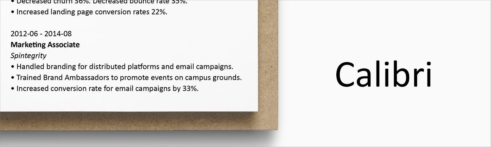
Combining two fonts on a cv is a frequent strategy used by many graphically interested resume writers. The finest font combos concur with each other, operate well with each other, and do not compete for the reader's attention.
Numerous candidates who combine fonts do so with two opposing types of fonts, such as a normal script and a cursive script, or sans-serif fonts like Calibri and Helvetica and serif fonts like Georgia and Cambria.
They'd then utilize one for the body of the resume such as skills and experiebnces while the other ones will be for their names and section title.
However, ensure that the font you use for your resume matches the font you use for your cover letter!
Furthermore, a strong cover letter that complements your CV will offer you leverage over other applicants.
Many job applicants are confused while selecting the best fonts to use for their projects. If you want your resume to remain unique and outstanding, you should use the following best fonts: Bookman Old Style, Cambria, Helvetica, Calibri, etc.
After selecting any of these easy-to-read typeface, you should consider limiting the font size to make it readable and more accommodating on your resume.
The font size should be kept between 10 and 12 points. If you use a smaller font size on your work, your resume may appear smaller for the recruiter to read. When you use a larger font size, your resume may exceed 3 or 4 pages, which is completely unacceptable in most working environments.
Therefore, you must endeavor to keep your font size to a good and accommodating standard to boost your chances of getting the job. Some job applicants are curious to explore other types of fonts not listed above.
When you prefer using serif and sans-serif fonts, keep in mind that you are still on the right track toward writing a good resume.
Bigger fonts help to draw attention to your name, profile, and section headings.
Some resumes can take up more than a single page, in this situation, as you can't accommodate all of your material on a single page, you can consider a sans-serif font at 10 points, however, that's the smallest font size you should consider using.
Saving your resume as a.pdf file can make the font may become distorted in transit. What you will do is Integrate the font in the file to ensure that your font remains intact.
When you are saving or printing as.pdf in Microsoft Word, navigate to Options > Save and choose "Embed fonts in the file" or something similar like in google docs.
To highlight key details like your name and subsection titles, utilize bolding, italicizing, and CAPITALIZING, just always reflect consistency.
Bold text is excellent for bringing attention to very few words. Even if you've already increased the title's font size, you can use bolding to make your subtitles stand out without unnecessarily enlarging them. Know that
Italics are beneficial for supporting your text emphasis. Italics can be used in locations such as your city and state and locations associated with an institution or a qualification listing.
It is not advisable to underline words or phrases in your resume or cover letter because this adds too much formatting and will make the CV appear crowded.
You should feel much comfortable choosing the best readable font for your good resume. Upon selecting a particular font, you are expected to write strictly on that particular font throughout the entire document.
As you begin to write your cover letter as well, stick to that same font, and your work will remain outstanding before hiring managers.
2. Set margins uniformly:
By standard, good resume margins must be 1-inch on all four sides. However, if you consider writing a single-page resume, you may need to remove some margin space out to accommodate your entire work history and skills.
Why is it critical to accurately adjust the margins on your resume?
If you set the margin of your resume to be too narrow, your paper will get jammed with text.
Recruiters will find it disorganized and looking rather unprofessional.
Your resume will appear blank or vacant if each side of your resume has huge margins on them.
What will be the recruiter's first impression when he sees your resume? This Job seeker hasn't got anything much to say.
Also, when you set adequate margins ensure that your resume is ATS-friendly.
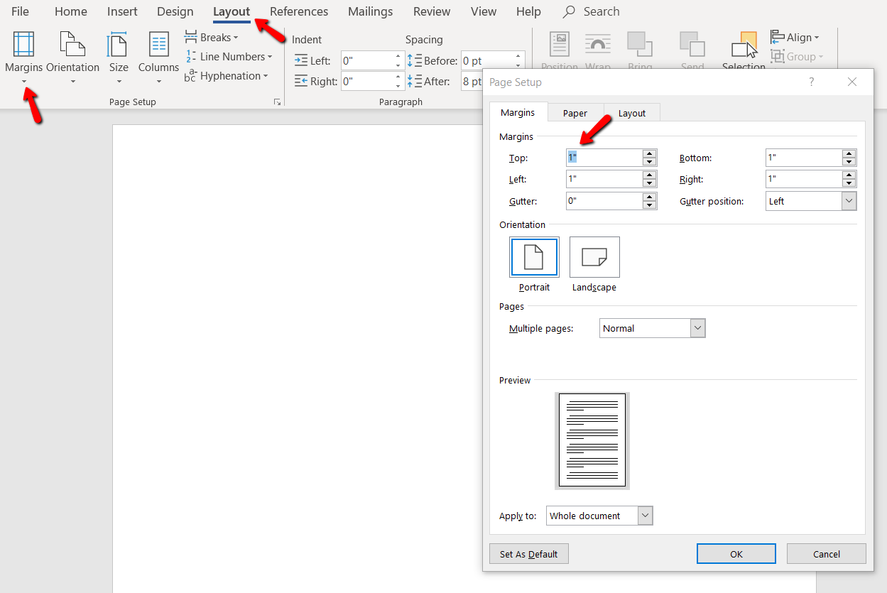
When you consider a single-page resume, ensure that the margin is kept at half an inch at least. Your primary goal is to ensure that those margins are uniform on all sides of the resume.
If your resume must read two pages, ensure that the margins set at both pages correspond to each other.
You may be the thing that the hiring manager is not checking into the margins of your resume. Professional recruiters only need a glance to expose resumes with poor margins. Hence, you must avoid every mistake that will push you into setting up poor margins.
This is how to change the margins in Microsoft Word:
- In the navigation menu, click Margins.
- Select the desired margin setting.
- Alternatively, you may use Custom Margins to set your margins.
3. Maintain uniform line spacing:
Just like formatting a book or other important documents, consistent line spacing is also necessary for formatting a good resume.
You need to format each section of your resume properly without overlooking anyone.
To be on the safer side, you should always keep your resume in single or 1.14 line spacing throughout the resume sections. However, the headings required double spacing before and after each one.
After writing your education and work experience section, you are expected to use double space in between the two entries.
Keep the heading sections clear:
As you begin to write the headings, ensure that they are much larger than the rest. It is not advisable to write both headings and other texts using the same font size.
The font size for resume headings should be kept between 14 to 16 pt. Preferably, you can make them appear more visible by writing your resume heading in ALL CAPS.
Your primary goal should rely on differentiating your resume heading from the regular descriptive texts.
If you fail to differentiate your headings and titles with font size and bold features, your recruiter may find it quite challenging to read through your resume.
Hence, you lose your chances of getting employed because of this slight mistake. Therefore, you must be ready to win the heart of recruiters by separating resume headings from regular texts.
Give enough white space:
Not giving enough space is one of the primary reasons people lose their chances of getting employed. Most recruiters scan through your resume as they review it.
But when you jam-pack the content information added to your resume, you are making the job appear much more difficult for them.
No recruiter will ever love to be stressed out by an applicant. Instead, they will drop your cluttered resume and move on to the next one.
If you want to remain outstanding, ensure that you give recruiters some breathing space through your style of writing. After formatting your resume, you should take a close look at it to confirm if it has enough white space on it.
But how can you achieve that? Once you are done with the creative write-up, print your resume and look at it from a distance.
If after a glance and you realize that it appears cramped. Consider reformatting it to give your resume a better look.
Repeat this process until you obtain a realistic result.
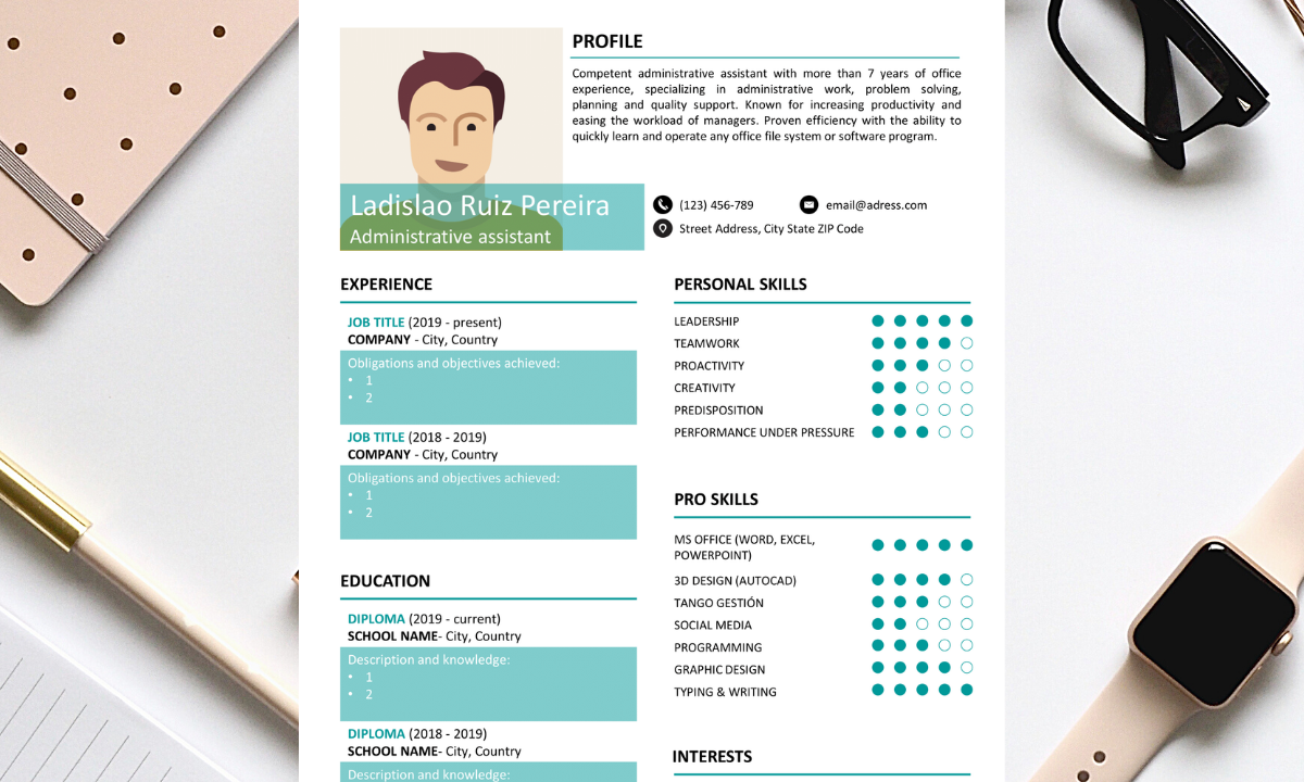
Add no photos and graphics:
For countries like the United Kingdom, the United States, and Ireland, do not add photos to your resume. The reason for this is that In these nations, the justifications for not putting a professional photo on your CV are straightforward: the country's strong anti-discrimination and labor regulations. Organizations are required to demonstrate that their employment practices do not include any stereotyping based solely on race, appearance, gender, color, age, or other factors.
Belgium, Africa, France, Portugal, Scandinavian countries, Germany, the Middle East, Asia, Austria, South America, Spain all allow images on resumes.
Even if companies do not specifically want one, a photo on your resume is typically advised in the aforementioned categories. Keep in mind, nevertheless, that conventions differ by organization, and international regulations are vulnerable to change.
As a result, some companies may request that you not submit a resume with a photo, in which case you should comply.
As a result, hiring managers do not always want to view applicant images supporting job applications as a precautionary measure.
Clearly, this rule has its exceptions, such as when searching for modeling or acting positions.
You may say that your specific country isn't mentioned but In many nations, however, the traditional resume criteria are not that clear cut or black and white.
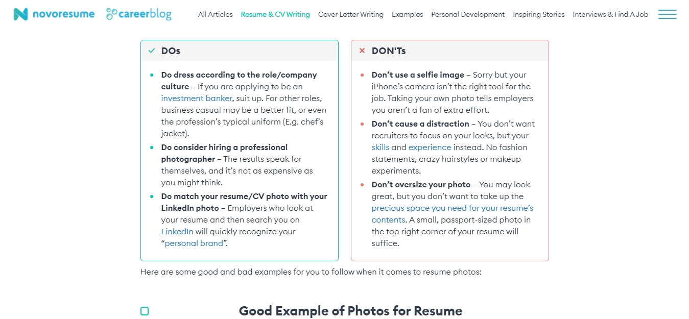
To be safe, we recommend if you are doubtful whether to add a photo or not, lease do not add.. the reason for this is that …,
If the company wants to see what you look like physically before the screening process, they will ask for a resume with a photograph as part of the application requirements,
Another reason is that hiring managers can still search for you online through Google or social media platforms like Twitter and Facebook.
As a result, without adding a photo, they will likely catch a peek of you – which is why job seekwers must have a clean online profile. You don't want o to sabotage your chances.
Most job applicants want to submit a colorfully designed resume to recruiters.
Some applicants even go as far as adding photos to the document. If you include fancy graphics in your resume, it may lead to failure during the ATS scan. Therefore, your beautiful graphics may turn against you when used in your resume.
If you prefer to add a photo to your resume, keep in mind that the recruiter may not be interested in seeing your face. However, if the job description requests a photograph, go ahead to include it in your resume.
But if not requested, never add a photo or graphics to your resume. Endeavor to keep it as simple as possible.
Go for a single Page:
Most job applicants are so anxious to include all their personal information, work history, skills, and a lot more in their resume.
After compiling their resume with this information, they may go the extra mile to come up with a three-page resume. If you are submitting a three-page resume, keep in mind that the recruiter may not be interested in going through the entire document.
The first page alone should convince the recruiter that you are the perfect candidate for the job. There is no need to express yourself, especially with two or three-page resumes.
A single-page resume is enough to land you your dream job.
As you write your single-page resume, concentrate more on writing specific job offers and add specifically, only important details. If the information is not worthy, consider removing it from your resume.
Ensure that every word you include to your resume merited it. But as you create your single-page resume and you realize that the relevant details will be omitted, go ahead to create a two-page resume.
However, you should try as much as possible to limit your resume to a maximum of two pages.
What are the best resume writing tips?
Writing a great resume comes with great responsibilities. Whether you have written a resume before, or you are anticipating writing a resume, you need to redefine your concept of writing a resume so that you will increase your chances of getting employed.
You don't just write a resume without learning from experts.
In fact, writing your resume based on what you already know may always kill your chances of outsmarting your competitors. Hence, you need to understand how to write your resume using various great tips.
Most job applicants often overlook some great resume writing tips because of their anxiousness to secure a job.
When you easily neglect several challenges associated with a job search, you will feel more relaxed and remember the smallest information required to write a great resume.
If you want to write an outstanding resume, you must abide by the following best tips for writing a great resume.
- Tips for a great resume:
1. Use only a professional email address:
Some job applicants prefer to use any informal email address on their resume like “sheni4real@yahoo.com, fruitsandflowers@gmail.com, Vera2sexy@hotmail”, these types of email addresses are wrong. When your email address appears unprofessional to the recruiter, your chances of getting employed will be drastically reduced.

You should show your professionalism at every stage and by all means.
Never use a strange email provider in your resume. Appear more professional by using only a professional email service provider such as Outlook or Gmail.
Ensure you use your real names as it appears in your resume profile. If your name is Denton Salman Ford, you can write DentonSalmanFord@outlook.com
Additionally, you should not add numbers to your email address like SalmanFord85@gmail because hiring managers may find it hard to remember the numbers. A lot of people argue that others answer their name so chances are that their full name is already taken.
You can also add variations to your name to differentiate the names but make sure it looks professional.
While creating your Gmail or outlook account, we said you should use your name to appear more professional. Never use your nickname or pet name to create a resume.
https://paypant.com/what-does-a-good-resume-looks-like/


Comments
Post a Comment